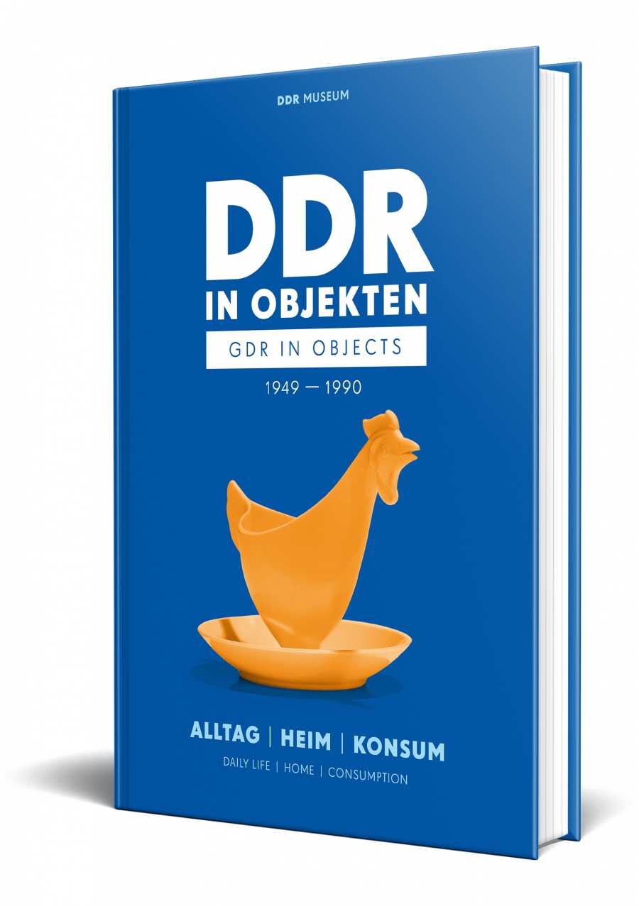
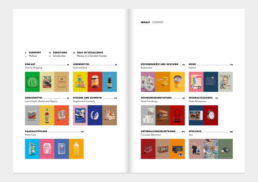
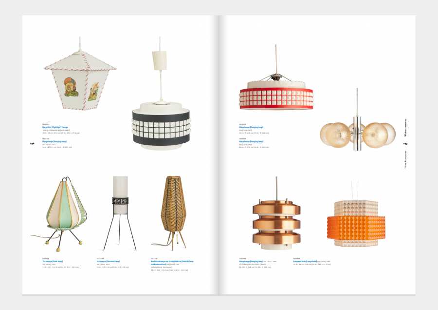
DDR in Objects 1949-1989
The Art Directors' 11 Favourites of the Collection Volume I
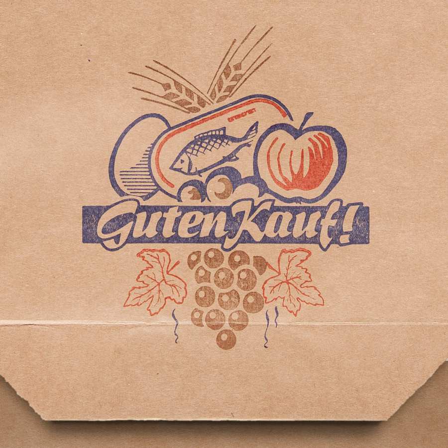
1. Paper bag »Good Buy!«
The very first object in the book is one of my favourites. This paper bag shows a beautiful graphic of three colours, which are printed one after the other on the bag in a letterpress process. You can imagine this as if you would press three stamps (one for each colour) one after the other on the paper. This method is cheap, but not always very accurate.
The graphics are very cleverly thought out: It does not matter how imprecisely these three colours are applied (»stamped«), because the result will almost always look good in this case.
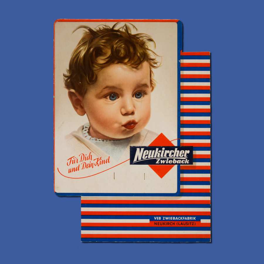
2. Advertising sign »Neukircher Rusk«
By chance, a little girl from Dresden became very famous. The little ambassador was not even one year old when the photo was taken in 1937. This photographic template was painted over (today one would say »retouched«) and used as an advertising motif on signs and tin cans. I particularly like this cardboard stand. The artist has hinted at two levels and has used faux shadows to create a subtle optical depth. Furthermore, the girl reminds me of my little niece.
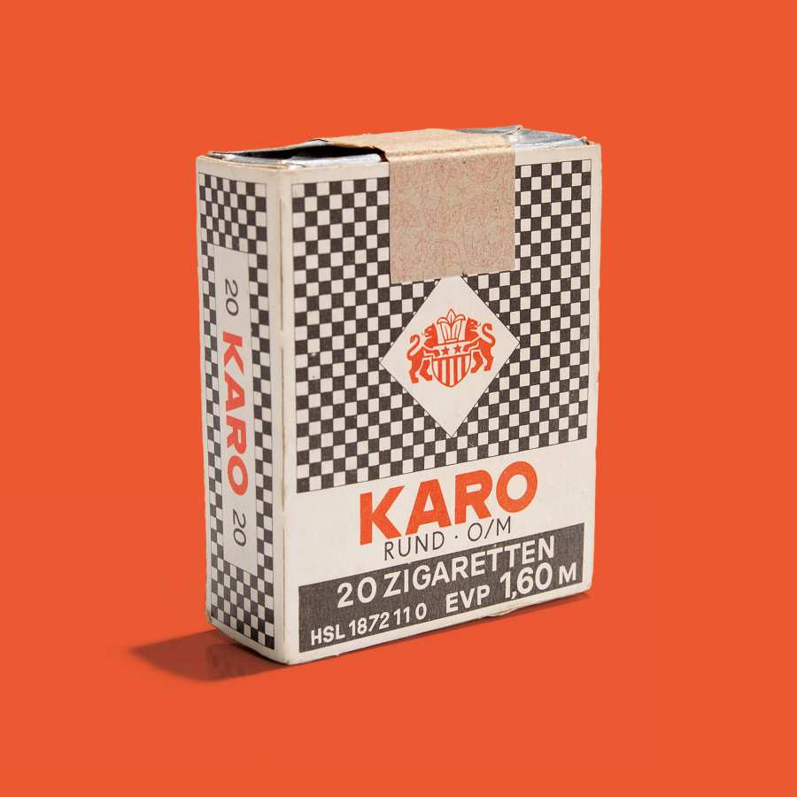
3. Cigarettes »Karo«
Because of their simplicity, the packaging of these »lung torpedoes« is at least as memorable as that of the tobacco design icons Marlboro (the one with the inverted triangle) or Lucky Strike (the one with the concentric circles). The filterless cigarettes are still sold today and the minimalist two-colour decoration is still visible on the one third of the surface where the graphics are placed nowadays.
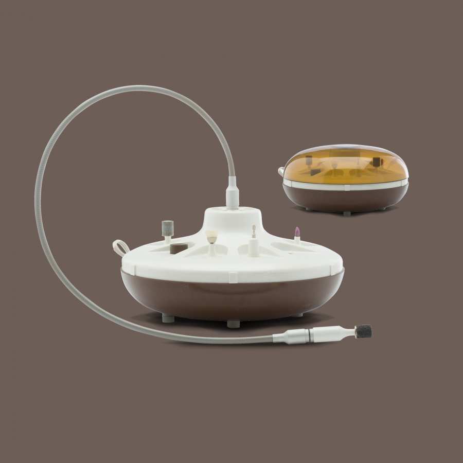
4. Manicure and pedicure set AKA Electric »YMP-5«
The industrial designers Peter Grahl and Horst Oehlke (Hochschule für industrielle Formgestaltung Halle) created this UFO-like design of an electric device for manicure and pedicure. The design dates back to 1974, when Sigmund Jähn became the first German to fly into space four years later. The race into space (known as the space age) inspired many industrial and architectural designers in the 1960s/70s. The State Security was also interested in UFO sightings (those in the sky) and investigated several cases in East Germany. The best known sighting occurred near Greifswald shortly before Reunification, in August 1990, but it turned out to be a Warsaw Pact military exercise.
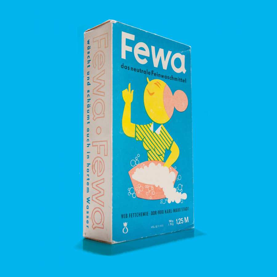
5. Laundry detergent »Fewa«
Fewa and the oldest avatar of the GDR: Johanna. However, the advertising figure existed even before the GDR. Over the years, Johanna was regularly adapted to the design perception of the time, overhauled and redrawn. The geometrically round face as well as the red »Lady Bun« have remained and are sufficient to recognise the figure again and again. Fewa, you make design look so simple!
6. Table menage
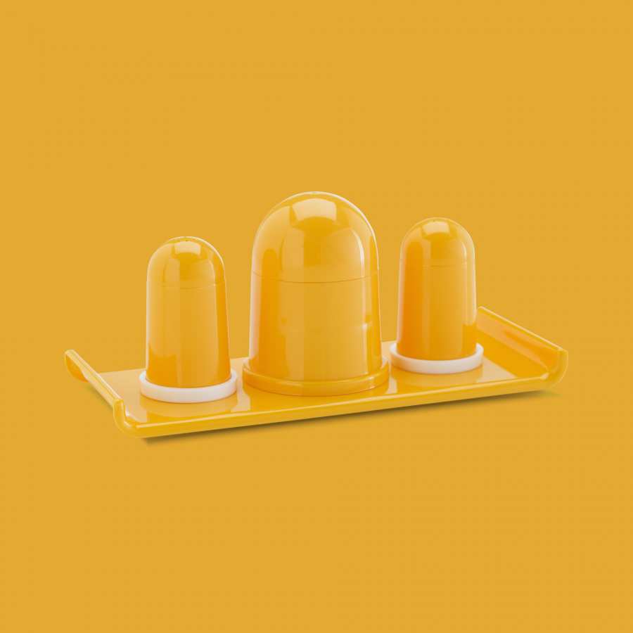
The packaging of the table menage of the VEB MLW Polyplast Halberstadt boasts in large, friendly letters with the words »TABLE MENAGE practical • shapely«. These are true words!
The table utensil includes a salt and pepper shaker as well as a barrel for all kinds of things. How practical! The shapely designer piece made of »polystyrene« (a really pretty name for plastic) was also available at a very reasonable price: The practical set cost only 39 pfennigs.
7. Self-sewn dress
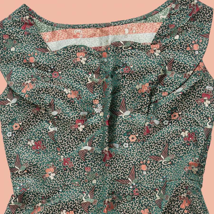
The self-sewn dress is truly beautiful, but it's the fabric that steals the show. On an emerald green ground there is a particularly beautiful pattern. In between there are cranes, various flowers, leaves and fruits. The ornaments may not be clearly visible, but wow! 1a.
8. Garden furniture »Senftenberger Egg Chair«
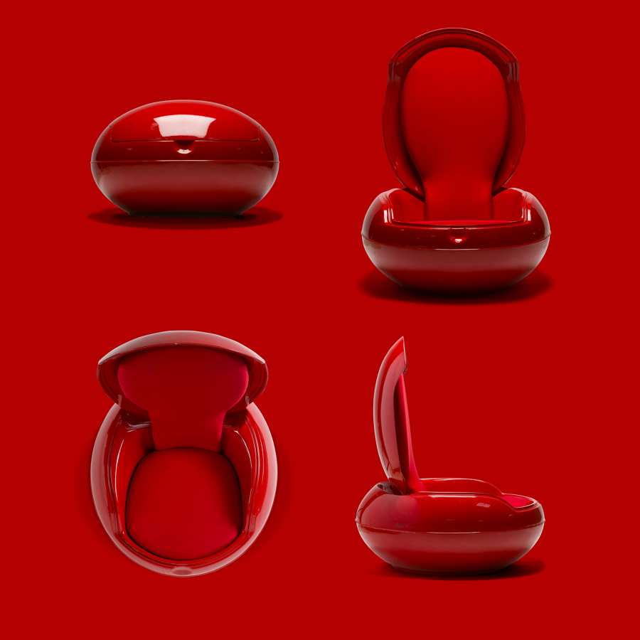
Next to the manicure and pedicure set, this is the second UFO of the collection. So we are back at the space age. What can I say?! I'm just a nerd. The Senftenberger Sitzei garden furniture, designed by Peter Ghyczy in 1968, is a design icon that ultimately turned out far too beautiful for the patio. That's why it's better off in a museum. Or in my living room...
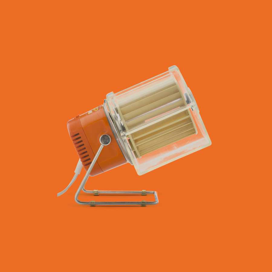
9. Table fan AKA Electric QL 2
1963: John F. Kennedy gives a speech in Berlin and announces that he is a Berliner. On the lectern stood the table fan HL 1 by Braun, which was designed by Reinhold Weiss in 1961.
My parents had a table fan in the 1970s/80s that looked suspiciously similar: the »Type 5830« table fan from the Belgian manufacturer KALORIK. This too turned out to be a genuine Berliner, as it was produced in East Berlin by AKA Electric. I remember how I was fascinated by this table fan and its unusual design as a child ... and how I once caught a finger. Which was somehow clear.
10. Television »Combi-Vision 3101«
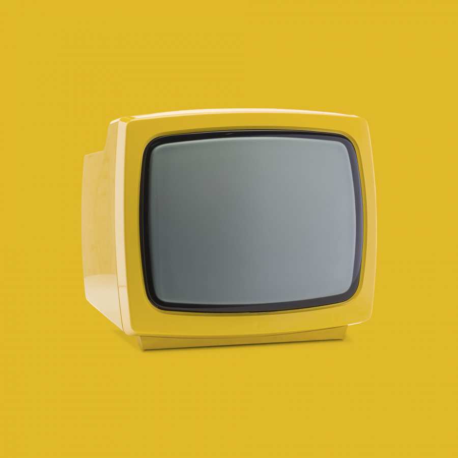
The courage to use colour! The television set »Combi-Vision 3101« was available in squeaky yellow, bright red and, well, white. The portable television set was designed in 1975 by Jochen Ziska (university lecturer and former rector of the University of Industrial Design Halle) and Klaus Ebermann. Ziska's products were strongly oriented towards the minimalist, production-oriented design of the Ulm College of Design (think of Dieter Rams, for example). Seen from the front, nothing distracts from the television programme. Brightness, contrast and station controls are out of sight. That's just as well, because you had to get up anyway to switch channels back then.
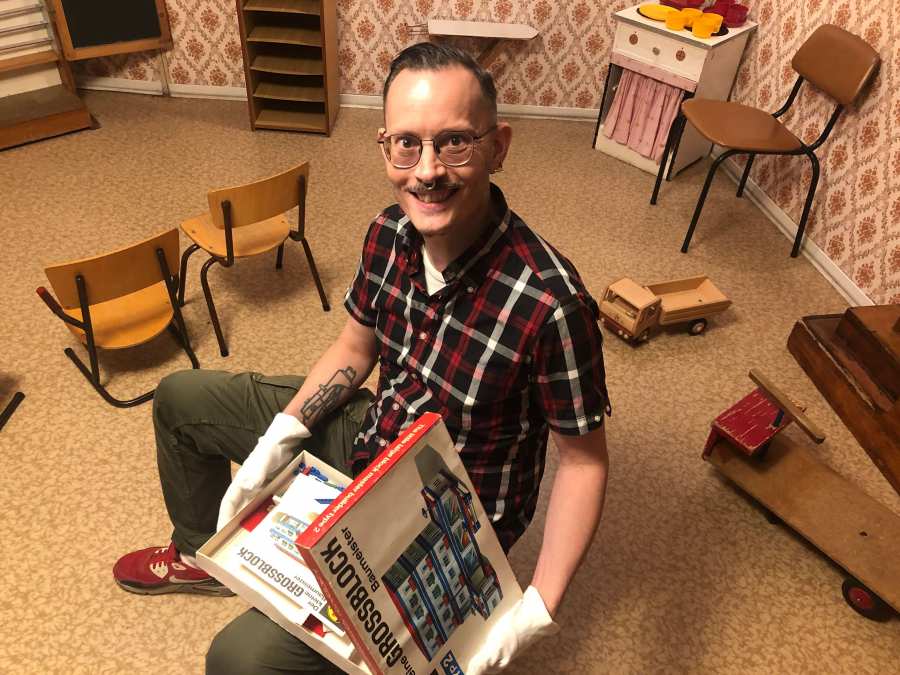
11. Building kit »Der kleine GROSSBLOCK Baumeister Typ 2«
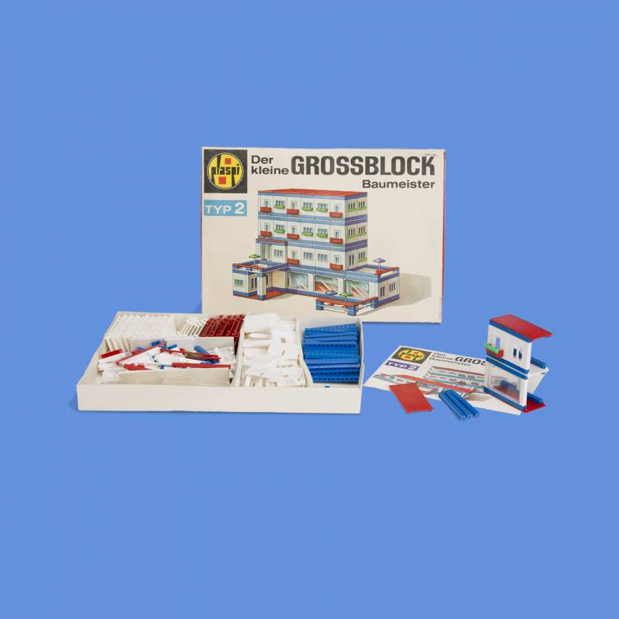
When you think of the GDR, you immediately see prefabricated concrete slab buildings in your mind's eye. The prefabricated components with a supporting structure made of in-situ concrete were much quicker to process than conventional masonry buildings. This construction method was therefore given preference during the state housing construction programme (from 1972). This resulted in the construction of around 1.8 to 1.9 million prefabricated housing units throughout the Republic in the period from 1972 to 1990.
However, this construction method was not able to establish itself among the toys. Even today, masonry buildings sets such as LEGO (or FORMO or PEBE in the DDR) bricks are more popular. This is what makes this building set such an exciting curiosity.
In the online shop: Collection volume I »GDR in Objects 1949-1990«
The first collection volume »GDR in Objects 1949-1990. Daily Life, Home, Consumtion« is either available in the museum shop or in the online shop of the DDR Museum
